01
Quiet authority
We work for people who cannot afford to be wrong. The brand never shouts. Confidence comes from restraint, space and precision, not from volume.
Brand system · v1.0 · October 2026
The principles, marks, colors, type and components behind TAM-C Intelligence Central and its products. One system for the website, the platform, decks, briefs and video. Switch between obsidian and paper to see every token and component in both modes.
Typeface
Hanken Grotesk
Data face
JetBrains Mono
Accent
Steel, plus one signal
Modes
Obsidian · Paper
01 · Philosophy
01
We work for people who cannot afford to be wrong. The brand never shouts. Confidence comes from restraint, space and precision, not from volume.
02
Ninety percent of every surface is ink and paper. Red is reserved for a signal: a priority, an alert, a red flag. If nothing is wrong, nothing is red.
03
Show the number, the timeline, the source. A sourced fact beats a superlative. If a figure has no source, it does not ship.
04
Our visuals borrow from the tools analysts use: consoles, ledgers, timelines and maps. Every element earns its place, and alignment is not optional.
05
Motion is measured, copy is short, and layouts breathe. The reader should feel that someone competent is in control.
06
We protect clients, subjects and sources. Anonymise scenarios, never imply a client relationship without consent, and mark illustrations as illustrative.
We are
Precise · Calm · Discreet · Evidence-led · Operational
We are not
Loud · Militaristic · Fear-selling · Gimmicky · Vague
The feeling
A quiet operations floor at 2 a.m., where everything is under control.
02 · Logo
Primary · on obsidian
Primary · on paper
Box mark
Clear space · x = box height ÷ 2
Minimum size
Below these, drop the descriptor or use the box.
Stretch or squash
Don't
Recolor
Don't
Add effects
Don't
Rotate
Don't
Busy backgrounds
Don't
Products carry their own wordmark and are always endorsed by TAM-C. Each wordmark is set in Hanken Grotesk with one signature letter: the chamfered A in ARGO NG, the lowercase e in TIMeR. ARGO NG and Kaymera may use the signal red as a brand color. TIMeR stays monochrome.
Intelligence command environment
ARGO NG · A TAM-C platform
Threat Indicators for the Monitoring of Risk
TAM-C TIMeR Program

Mobile privacy, minus the risk.
Kaymera · A TAM-C company
03 · Color
Paper · light mode
Obsidian · dark mode
Signal · status only
Proportion · per surface
Contrast · WCAG 2.2
04 · Typography
Brand face · 400 500 600
Aa
Hanken Grotesk
ABCDEFGHIJKLMNOPQRSTUVWXYZ abcdefghijklmnopqrstuvwxyz 0123456789 · → %
Headlines 500, body 400, buttons and navigation 600.
Accent · 500 600
Aa
Chakra Petch
ABCDEFGHIJKLMNOPQRSTUVWXYZ abcdefghijklmnopqrstuvwxyz 0123456789 · → %
IDs, stat numbers and short labels. 600 when small, 500 when large.
Data face · 400 500
Aa
JetBrains Mono
ABCDEFGHIJKLMNOPQRSTUVWXYZ abcdefghijklmnopqrstuvwxyz 0123456789 · → %
Uppercase labels at 10 to 11 px with 0.16 to 0.2 em tracking.
Display XL
Hanken Grotesk 500 · clamp(2.6rem, 5vw, 4.8rem) · -0.025em · 1.06
Intelligence Central.
Display L
Hanken Grotesk 500 · 3.6rem · -0.025em · 1.06
Know the subject first.
Heading
Hanken Grotesk 500 · 2rem · -0.025em · 1.06
One picture, one watch list.
Title
Hanken Grotesk 600 · 1.25rem · -0.01em · 1.3
Escalation packet ready for review
Body L
Hanken Grotesk 400 · 1.125rem · 1.6
Signals from HR, IT, physical access and open sources, scored against each subject's own baseline.
Body
Hanken Grotesk 400 · 15px · 1.6
Every program runs four phases: scope, baseline, monitor and escalate.
Eyebrow
Hanken Grotesk 600 · 13px · 0.02em
Insider threat · Early warning
Accent
Chakra Petch 600 · uppercase · 0.04em
POI 0412 · Case 2026-117
Label
JetBrains Mono 500 · 11px · uppercase · 0.18em
Case file · 30 Sep 2026 · 02:41
Navigation
Hanken Grotesk 600 · 11px · uppercase · 0.08em
Capabilities Platform Company
Figures · accent
12,000
02:41 · 37 min · 9.6 / 10 · P1
Headline pairing
30 seconds to react in the air. Months to see it on the ground.
Rules
05 · Layout
12 columns · 1400 px · 32 px gutters
Spacing · 4 px base
Sections use 112 px of vertical padding (72 px on mobile). Cards use 24 to 32 px.
Shape
06 · Components
Buttons · .btn-primary · .btn-ghost
14 px Hanken Grotesk 600 · padding 14 by 22 · hover drops opacity to 0.88 or darkens the hairline.
Tags, priority and status
Form field
Section header
Capabilities
Eyebrow, display headline and one supporting sentence. Nothing else above the fold.
Stat card
37min
Pattern detection lag, defense case
Escalation packet
P1POI 0412
Case card
IP exfiltration, disrupted before it completed
Embedded analyst, client SOC and ARGO NG timeline. Anonymised.
Read the case →Threshold crossed · POI 0412
Score moved from 3 to 4 at 02:41. The escalation path has fired and the packet is ready.
07 · Data UI
Score ladder
Detection window
Signal in the noise
| Time | Source | Signal | Score | Priority |
|---|---|---|---|---|
| 02:41 | Repository | Off-hours bulk access | 4 | P1 |
| 01:58 | Facilities | Badge use at a closed site | 3 | P2 |
| 23:12 | Open source | Hostile post naming staff | 2 | P3 |
08 · Motion
Enter
0.5 s · power3.out · rise 14px
Panels, cards and lines arriving
Crossfade
0.4 to 0.5 s · power1.inOut
Scene to scene, page to page
Stagger
60 to 120 ms
Lists, rows and grids build in order
Emphasis
1.12 scale · 0.12 s in, 0.25 s out
A single pop on the word that matters
Push
1.025 to 1.04 over the scene
Slow camera drift, never a zoom-punch
Signal pulse
2.4 s · ease-out · loop
Live status only
Build on the word
09 · Imagery
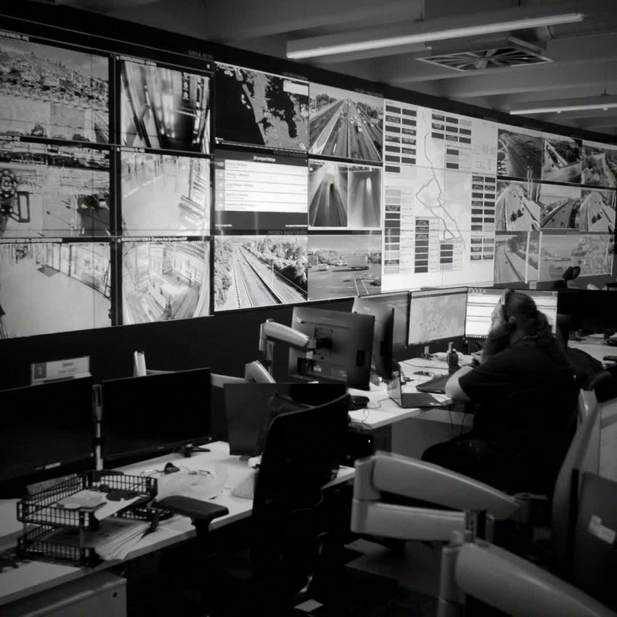
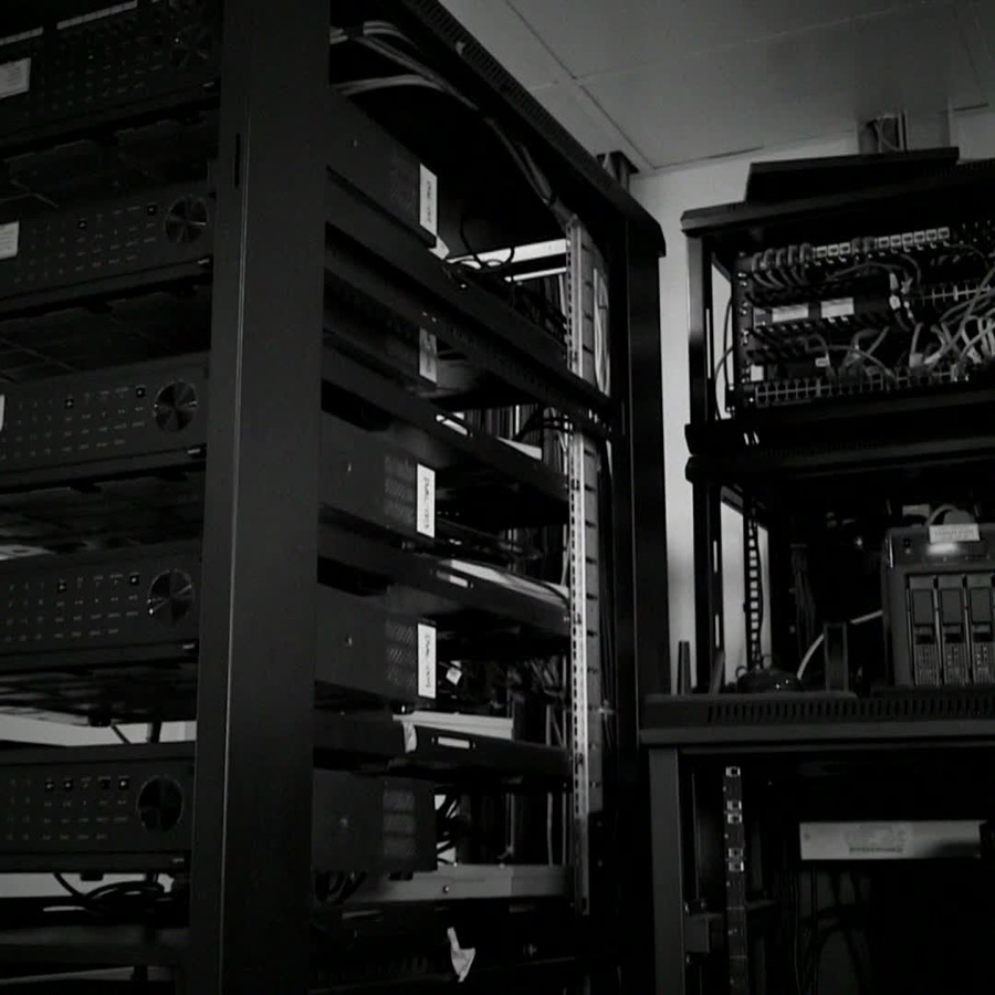
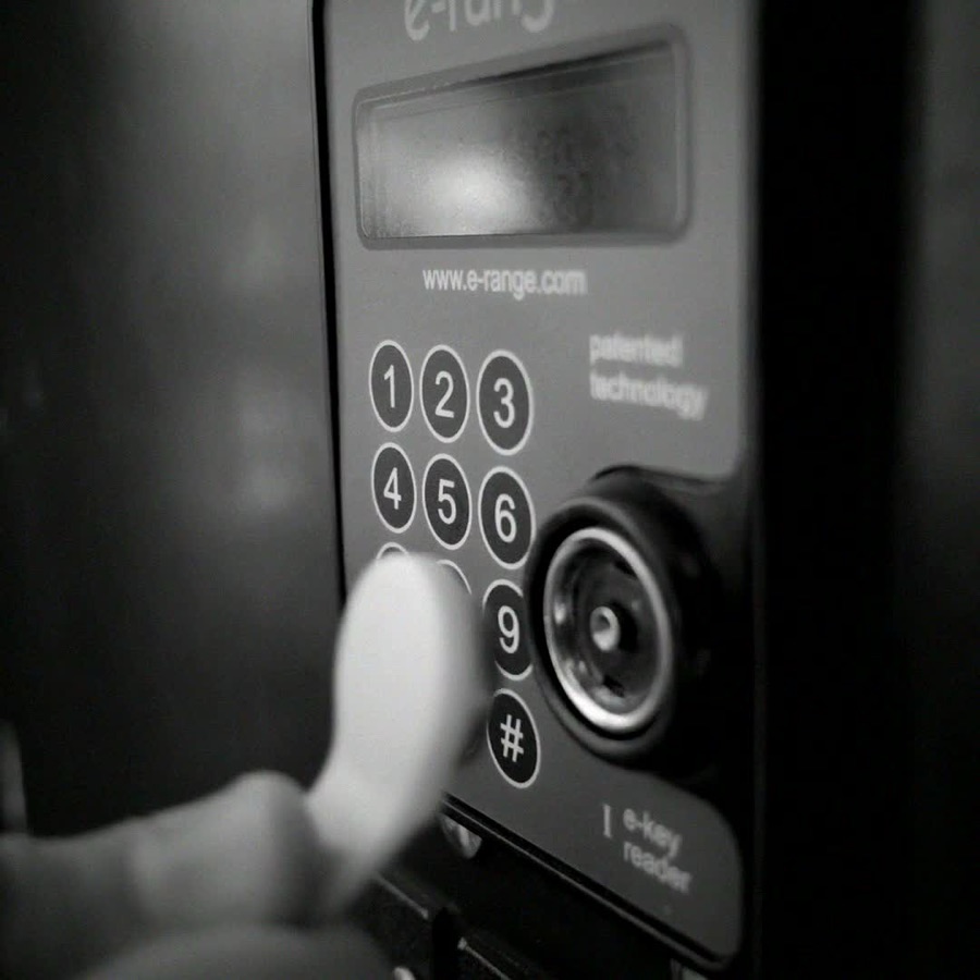
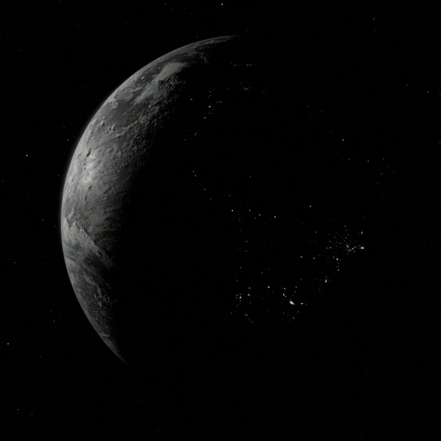
Use
Avoid
10 · Voice
Say what happened, then what it means.
“The insider surfaced 37 minutes after the first anomalous action.”
Do
“Our revolutionary AI instantly catches every bad actor!”
Don't
Numbers carry a source, or they don't run.
“Trusted by 25% of Fortune 500 companies.”
Do
“Thousands of breaches stopped every year.”
Don't
Short sentences. Plain words.
“Cross the threshold, and escalation fires.”
Do
“Upon the breach of pre-configured thresholds, an escalation workflow may be initiated.”
Don't
Respect the people involved.
“An illustrative scenario, not based on any individual.”
Do
“Here's how we caught the traitor.”
Don't
Name
TAM-C, always with the hyphen and capitals. Never Tamc or TAMC.
Products
ARGO NG, TIMeR, Kaymera. Written exactly so.
Descriptor
Intelligence Central. Never Intelligence Centre.
Sign-off
Ops@tamcintel.com for every call to action.
11 · Resources
Design tokens · CSS
/* TAM-C tokens · paper (default) */
--color-bg: #ffffff;        --color-surface: #f5f5f7;   --color-surface-2: #e8e8ed;
--color-ink: #111113;       --color-ink-dim: #48484a;   --color-ink-faint: #6e6e73;
--color-accent: #4b5563;    --color-line: rgba(17,17,19,0.10);
--color-signal: #b8311e;    --color-amber: #a25c00;

/* .theme-dark-island · obsidian */
--color-bg: #0b0b0c;        --color-surface: #1c1c1e;   --color-surface-2: #2c2d30;
--color-ink: #f5f5f7;       --color-ink-dim: #c7c7cc;   --color-ink-faint: #8e8e93;
--color-accent: #9aa4ae;    --color-line: rgba(255,255,255,0.10);
--color-signal: #f94a46;    --color-amber: #ffc46b;

/* Type */
--font-sans: "Hanken Grotesk";  --font-accent: "Chakra Petch";  --font-mono: "JetBrains Mono";
/* Radius 2px · hairlines 1px · sections 7rem · container 1400px / 980px */